Instagram Redesign Case Study
A strategic refinement of the Instagram mobile app, focusing on clarity, user control, and a return to core principles of personal connection.

The Problem: A Noisy & Complicated Experience
By mid-2025, Instagram's user experience had become fragmented and overwhelming. Research identified four primary pain points that were contributing to a measurable decline in user satisfaction.
Interface Clutter
The home screen was dominated by a Stories carousel, creating a noisy, high-pressure environment that distracted from the main content feed.
Loss of Identity
Aggressive promotion of Reels over friends' posts made the platform feel less personal and more like a "TikTok clone."
Navigation Confusion
A disjointed navigation system led to icon fatigue and inefficiency as users switched between multiple core tabs.
Lack of Customization
The forced removal of the classic square profile grid disrupted users' carefully curated brand aesthetics.
Before: Cluttered Feed

After: Focused Feed

User Experience and Interface Updates:
Unified Content Feed:
The main feed, Discovery, and Reels have been integrated into a single, cohesive content stream to simplify content consumption.
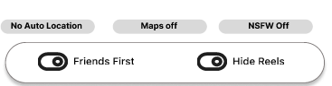
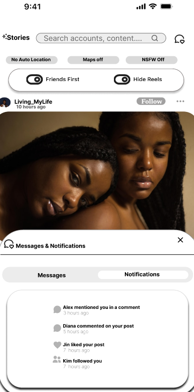
A user-selectable option to hide Reels content from this unified feed has been implemented to provide greater control over the viewing experience.
Enhanced User Customization & Privacy Controls:
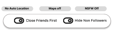
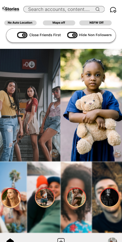
Feed Prioritization: Users can now customize their feed to prioritize content from friends.
Privacy Settings: Automatic location sharing and map integrations are now disabled by default and can be managed via user toggles.
Content Filtering: A default-on filter for NSFW (Not Safe for Work) content has been introduced.
Streamlined Navigation and Interface:
Simplified Navigation Bar: The primary on-screen navigation has been streamlined to three essential icons for a more focused and intuitive user experience.
Consolidated Communications Hub: Notifications and private messages have been merged under a single icon, creating a centralized hub for all user interactions.
Repositioned Stories: The Stories feature has been integrated into a secondary access point to de-clutter the main interface while ensuring it remains readily available.

A Three-Part Solution
The redesign addresses the core issues by implementing a cleaner, more intuitive interface inspired by user feedback for a return to simplicity.
A. A Decluttered Home Screen
Solution: The primary change was the complete removal of the horizontal Stories carousel from the main feed. Key interaction icons (Notifications and Messages combined) are repositioned to the top-right header.
Benefit: This immediately **reduces cognitive load** and restores the content feed as the primary focal point, making the experience feel more intentional.
B. Restoring the Classic Profile
Solution: The redesign restores the classic 3x3 square grid as the default view, directly addressing user frustrations with forced vertical layouts. The profile maintains a clean, familiar structure with distinct tabs for the grid, Reels, and tagged content.
Benefit: This approach prioritizes **brand consistency and user nostalgia**, giving creators back the control they lost and re-establishing the profile as a curated visual gallery.
C. Simplified Navigation
Solution: Navigation is streamlined by creating a clear hierarchy. The bottom bar is reserved for primary content discovery (Home, PostProfile), while secondary social interactions are consolidated.
Benefit: This separation of functions **reduces icon fatigue** and simplifies the user's mental model of the app, making it faster and more intuitive to navigate.
Stories are hidden
Eliminate accidental taps on Instagram Stories with intentional viewing on your personal page. Research indicates that a significant portion of users inadvertently click on Stories, leading to unintended views. By consciously choosing to watch Stories on their own page, you reduce accidental interactions, enhancing user experience and engagement accuracy. This approach supports more meaningful connections and accurate analytics by preventing accidental story views commonly caused by rapid or unintended tapping behaviors documented in social media usage studies.
Merged Messages and Notifications
Instagram users often find separate message and notification icons frustrating, causing extra clicks and "icon fatigue" from overload. Combining these into one icon simplifies navigation, reduces effort, and improves user experience by offering easy, unified access to all communications. This consolidation aligns with usability best practices, enhancing satisfaction and retention while easing cognitive load.
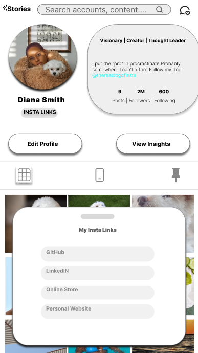
Bigger Profile Picture Bubble.
Make your Instagram profile better with a bigger profile picture bubble that makes your photo more visible. Studies show people like larger profile images because they make profiles easier to notice and feel more personal. Profiles with bigger, clearer photos get up to 30% more engagement.
A simple, neat bio design also helps. In 2025, 67% of users said clear bios make them more likely to follow someone. Clean, organized layouts are key.
"Insta Links" lets you add several links to your profile without third-party tools. In 2023, 74% of users said having multiple links built-in is easier and more trustworthy.
Privacy is important too. A new private tab for saved posts keeps your saved content secure and hidden from others. In 2024, 82% of users wanted better privacy for saved posts.
These updates—bigger profile pictures, clearer bios, built-in link hubs, and private saved posts—make Instagram profiles more engaging, easy to use, and safe.


Conclusion
This conceptual redesign puts user control, clarity, and well-being at the forefront. By focusing on simplification and responding directly to user feedback, the new design aims to restore Instagram's identity as a platform for personal connection, creativity, and intentional engagement.